Editorial systems for a national lifestyle magazine.
Each issue starts from the previous one. The same grid, typography and recurring section layouts keep Gloss recognisable — while every article is composed around its own text and photographs.
Editorial & information design · National lifestyle magazine
Gloss
Editorial systems for a national lifestyle magazine.
Editorial & information design · National lifestyle magazine
Each issue starts from the previous one. The same grid, typography and recurring section layouts keep Gloss recognisable — while every article is composed around its own text and photographs.
Gloss
One masthead, four issues.
The masthead and accent colour change with each issue; the cover-line pattern — a coloured category, then the topic in white capitals — stays the same.

No. 312 · October 2026

No. 292 · February 2024

No. 291 · December 2023

No. 285 · April 2023
SCOPE
Covers, section openers, features, shopping and trend pages
PERIOD
2009–present
About 8 issues a year
PROJECT
Gloss
Lifestyle magazine, Slovenia
ROLE
Editorial design
02 — The system
Five page patterns, used issue after issue.
What stays fixed: the grid, the typography and a handful of section layouts. What changes: every article, shaped around the length of its text and the photographs it gets. Each pattern solves a different reading problem.
1 Section openers
2 Shopping as information design
3 Long-form features
4 Trend and news pages
5 Branded content
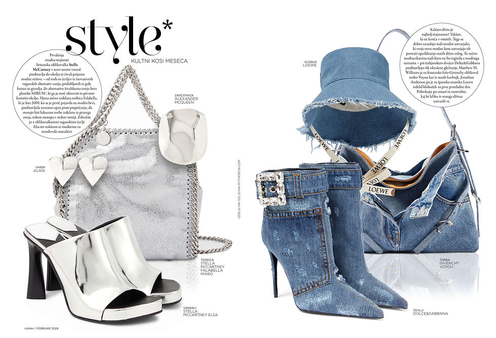
“style*” — cult pieces of the month · February 2024

“ideje” — ten numbered products, ten numbered descriptions
1 One oversized word, one quiet line.
Recurring sections open with a single word set very large in a display serif, with a line of small capitals beneath it. Readers learn the pattern and recognise a section at a glance.

Shopping · July/August 2023 — 25 numbered products, one caption index per page

Shopping · November — a 3 × 3 grid with drawn rules
2 Numbers that link an image to its details.
Every product carries a number that points to one caption index at the foot of the page: brand, item and price in a single scannable line. Grid pages use drawn rules to hold products and section titles in a calm, even order.

3 Several ways into one long story.
A section label, a display headline with a drop capital, an italic standfirst, the byline and named subheads give readers several entry points — from a three-second glance to a full read.
Life stories · June 2023 — section label, drop-cap headline, standfirst, byline, named subheads

Trendsetting — six short stories on one spread

5 Advertising in the magazine’s own voice.
Promotional pages follow the same type and image rules and carry a clear label, so they sit naturally in the issue without misleading readers.
“Rdeča” — a promotional spread in the editorial style, labelled as a promotion

“360°” made in Slovenia · March — five stories around one opener
4 Many short stories, one rhythm.
Trend and news spreads carry five or six short stories each. Vertical rules, one heading style and image-led blocks keep a busy spread readable.
02 — The system
Five page patterns, used issue after issue.
What stays fixed: the grid, the typography and a handful of section layouts. What changes: every article, shaped around the length of its text and the photographs it gets. Each pattern solves a different reading problem.
1 Section openers
2 Shopping as information design
3 Long-form features
4 Trend and news pages
5 Branded content
1 One oversized word, one quiet line.
Recurring sections open with a single word set very large in a display serif, with a line of small capitals beneath it. Readers learn the pattern and recognise a section at a glance.
“style*” — cult pieces of the month · February 2024
“ideje” — ten numbered products, ten numbered descriptions
2 Numbers that link an image to its details.
Every product carries a number that points to one caption index at the foot of the page: brand, item and price in a single scannable line. Grid pages use drawn rules to hold products and section titles in a calm, even order.
Shopping · July/August 2023 — 25 numbered products, one caption index per page
Shopping · November — a 3 × 3 grid with drawn rules
3 Several ways into one long story.
A section label, a display headline with a drop capital, an italic standfirst, the byline and named subheads give readers several entry points — from a three-second glance to a full read.
Life stories · June 2023 — section label, drop-cap headline, standfirst, byline, named subheads
4 Many short stories, one rhythm.
Trend and news spreads carry five or six short stories each. Vertical rules, one heading style and image-led blocks keep a busy spread readable.
Trendsetting — six short stories on one spread
“360°” made in Slovenia · March — five stories around one opener
5 Advertising in the magazine’s own voice.
Promotional pages follow the same type and image rules and carry a clear label, so they sit naturally in the issue without misleading readers.
“Rdeča” — a promotional spread in the editorial style, labelled as a promotion
04
Deadlines with editors and advertisers
03
Numbered index
02
Cover lines and section labels
01
Fixed system, flexible content
03 — What carries over to UX
The same discipline, a different medium.
➜ Stakeholders
Shipping on schedule with editors, photographers and advertisers.
➜ List and detail
Linking an item to its details without clutter is the same problem in a product list.
➜ Navigation
Telling people where they are and what is inside, before they commit to reading.
➜ Design system
One grid and type system, with every article composed around real text and images — like components that adapt to unpredictable content.
03 — What carries over to UX
The same discipline, a different medium.
➜ Design system
One grid and type system, with every article composed around real text and images — like components that adapt to unpredictable content.
01
Fixed system, flexible content
➜ Navigation
02
Telling people where they are and what is inside, before they commit to reading.
Cover lines and section labels
➜ List and detail
Linking an item to its details without clutter is the same problem in a product list.
03
Numbered index
➜ Stakeholders
Shipping on schedule with editors, photographers and advertisers.
04
Deadlines with editors and advertisers
04 — My role
Gloss, issue after issue, since 2009.
Some pages I lay out within established section templates; others I design from scratch around the text and photographs.

Behind the pages, in InDesign: the “style*” section and a feature spread share one set of margins, columns and guides.
Starting point
The previous issue, with its grid, typography and recurring layouts
Grid
One set of margins, columns and guides for every spread
Tools
InDesign, Photoshop, Lightroom, Illustrator
Behind the pages, in InDesign: the “style*” section and a feature spread share one set of margins, columns and guides.
05 — In the editor’s words
“Throughout our long-standing collaboration, she has consistently demonstrated outstanding creativity, a keen eye for detail, and a strong understanding of visual communication.”
Tea Hegeduš, PhD · Editor-in-chief, Gloss magazines
The design carries the grid, typography and recurring section layouts from one issue to the next, and composes every article around its own text and photographs.
DESIGN SUMMARY
The design carries the grid, typography and recurring section layouts from one issue to the next, and composes every article around its own text and photographs.
One magazine.
Every article its own.
NEXT PROJECT