NATIONAL ADULT EDUCATION PORTAL · REDESIGN
Kam po znanje
Slovenian for “where to go for knowledge.”
The national portal for adult education in Slovenia, where people look for learning, providers publish it and professionals follow the field. I redesigned how all three find their way through it.
Homepage — the first decision: general public or professionals
Original Figma design · 1440

SCOPE
Information Architecture
Navigation & content structure interface design
CONTENT
Andragoški center Slovenije
Slovenian Institute for Adult Education
PROJECT
Redesign of existing adult education portal
ROLE
Sole designer
UX/UI & visual design
01 — THE STARTING POINT
A portal named
after a question.
Kam po znanje already existed. It brought adult education across Slovenia into one place: programmes, providers, news and professional resources. The task was not to invent a product but to make a large, mixed body of information answer its own name, for everyone who arrives with a different version of the question.
Kje lahko dokončam izobraževanje?
Where can I finish my education?
Kje se lahko naučim tujega jezika?
Where can I learn a foreign language?
Kam po računalniška znanja?
Where do I go for computer skills?
Kje pridobim poklicno kvalifikacijo?
Where do I get a vocational qualification?
The homepage opens with the questions visitors actually bring, not with the institution. Quoted verbatim from the hero of the design.
02 — THREE AUDIENCES
One portal, three reasons to arrive — and two of them depend on each other.
Learners
come to find a programme, a provider, or someone to ask.
Želim se učiti — I want to learn
↕ Every programme a learner finds was entered by a provider.
Providers
come to publish, and to keep what learners find up to date.
Želim objaviti izobraževanje — I want to publish education
come for the field itself: training for educators, reports, research, events.
Strokovna javnost — Professional public
Professionals

I want to learn
I want to publish education
Professional public
The navigation names intentions, not departments.
Three of the main items are written in the visitor’s voice. The first click becomes a decision about yourself — learner, provider, professional — rather than a guess about how the institution is organised.
03 — LEARNERS
Begin with intent, not with the catalogue.
The learner hub doesn’t open with a search form. Each step adds one level of structure, so that by the time programmes are listed, the list is short enough to read.
A Choose a direction
B Narrow by subject
C Read the results
D Or search directly
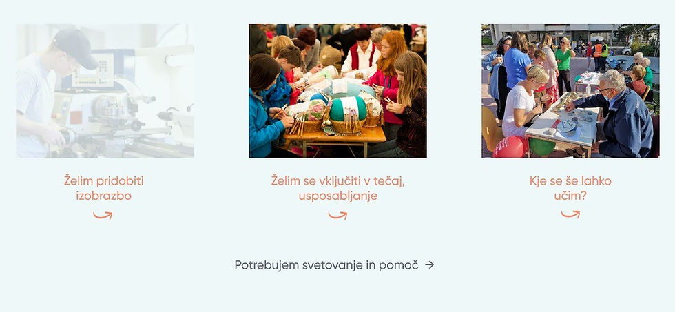
A Three routes, and a way to ask.
Gain a qualification, join a course or training, or find where else to learn. Advice and support sits beneath them as a quiet text link — always in reach, never competing with the routes.

B Narrow first, then list.
The course route asks for a subject area before anything is listed. The labels in this screen are the design’s own placeholders.

C No anonymous courses.
Results set every programme beside the institution that runs it, so the next step — who to contact — is already on the page.

D Search from either side.
For visitors who already know what they want, search mirrors the portal’s central relationship: providers (100+ in the design) or programmes (1000+), each with keyword and date, and a path to more detailed criteria.
04 — EDUCATION PROVIDERS
Behind every result, someone keeps it current.
Providers needed a path of their own: register the organisation, sign in, then add and maintain programme records. The design treats this as a workspace inside the portal, not as one more page of the website.
PUBLIC WEBSITE

PROVIDER WORKSPACE

Same header. A different job.
In the provider workspace, the navigation narrows to the provider’s tasks — Home, Organisation, Programmes, Input guide, Log out — on a coral band, so it is always clear which side of the portal you are on.

01
The workflow, set out on the first screen.
The workspace home sets out three numbered steps: check the organisation’s details, review existing programmes, add new ones. Each step names the menu item it refers to.
02
Records at a glance.
The programme list has columns for publication on the website, publicly valid programme and entry date, with an “Add new programme” button above it.

“Before publication on Kam po znanje, the entered data is reviewed and confirmed by an administrator at the Slovenian Institute for Adult Education.”
From the provider guidance text in the design, translated.
One long record, made legible.
A programme record carries a lot. The form breaks it into named panels across two columns, so a provider can see what belongs together and what is still missing.

1
2
3
4
5
6
7
1
Help is linked from the top of the form, before the first field.
2
Programme name: a publicly valid yes/no choice, a selection field and a name field.
3
Qualification obtained: a selection field, plus a field for “Other”.
4 · 5
Type and field of education follow the national KLASIUS classifications, each with two level selectors.
6
Entry requirements: a no/yes choice, followed by fields for prior education, work experience, languages and other conditions.
7
Target groups and delivery mode: lists of checkboxes, each with an “Other” field.
Below
The record continues with content and links, location and duration, dates, price and a contact person — each in its own panel.
05 — PROFESSIONALS
Adult educators and decision-makers get a hub of their own. It has its own hierarchy, but keeps the portal’s navigation, type and components.
A deeper layer,
in the same language.
Strokovna javnost — the professional hub opens with context and a voice, not with a list.


Different content types, each with a clear destination.
Annual portal reports, InfO-mozaik and the digital reading room sit side by side as parallel destinations, each with its own icon, title and short explanation. Training for educators in the EPALE corner reuses the same dated listing as courses elsewhere on the portal.
MY CONTRIBUTION
I designed the structure that lets three audiences share one portal.
INFORMATION ARCHITECTURE
Organised the portal around three audiences, each with its own entry route, within one shared structure.
NAVIGATION
Structured the main navigation around what visitors came to do, and gave providers a separate workspace navigation.
AUDIENCE JOURNEYS
Learners narrow by intent and subject before results, or search by provider or programme. Providers move from registration to a list of records to a structured programme form. Professionals reach distinct destinations for reports, research, training and news.
UX/UI & VISUAL DESIGN
Designed the interface and its visual language across the public site and the provider workspace: questions as headlines, coral for action, the same panels for entering and reading information.
I was the sole designer, responsible for the UX/UI and visual design shown in these screens. Project requirements, content and technical functionality were shaped within the client’s project and are not presented here as my own decisions.
Start from who arrives and what they came to do. Then let the structure carry that intent from the first menu item to the last form field.